G-P
Brand Identity System, Logo Design, Sonic, Motion Principles, Art Direction, Illustration
Formerly known as Globalization Partners, G-P helps businesses rapidly expand internationally while ensuring legal compliance locally via their industry-leading employment platform.
With remote working soaring in our post-pandemic world, G-P wanted to cement their position as a category-defining brand on a mission to break down barriers to global business and enable opportunities for everyone, everywhere. To express this boundlessness, the movement of the sun across timezones became the inspiration to create G-P's brand as a world that taps into the fullness of human potential. The ultimate goal was to consolidate their position as the most transformative, universally reliable and intuitive partnership provider in the Employer of Record field.
The concept was inspired by the way G-P enables businesses to expand their global workforce regardless of location. This led to the overarching idea of Boundlessness. The system is vibrant, energized, and expansive. At its core, it is built around the global nature of the company and the system of gradients—representing the colors of the earth and dawn to dusk—brings to life the time zones that span across the globe.
The new logo takes inspiration from the 24 time zones, while using the new palette’s earth colors as an expression of communication and connection. Motion through the logo sees the gradient and three inset circles sequenced according to the movement of an inner circle appearing from east to west, a nod to the path of the sun around the world.
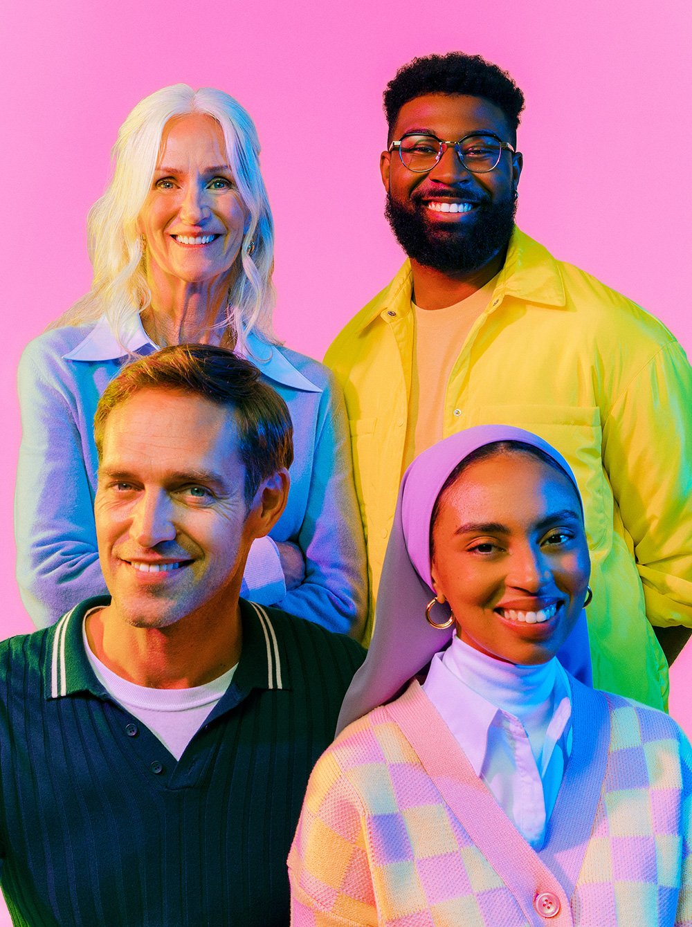
Extensive and comprehensive brand guidelines were built and with some pre-production help, G-P partnered with photographer Joel Arbaje to direct a custom portrait photoshoot to use in their new brand campaign.
In the year since the rebrand customer acquisition increased 2.5 times, and G-P has solidified their position as the global employment platform market leader with approximately $1 billion in Annual Recurring Revenue and 98 percent customer satisfaction ratings. In 2022 they raised $200 million (valuing the business at $4.2 billion), which they will utilize to expand their dominant share of the virtually untapped, $176 billion global remote employment market.
TEAM
Sarah Agnone
Jemma Campbell
Andy Lawrence-Levy
Joey Nanni
Michelle Wu
Gradient Type
Antfood
Joel Arbaje